Your YouTube channel banner is the first thing a new viewer sees when they land on your page. A blank or generic header can cost you a subscriber before you have said a word. Most creators know they need a sharp banner but get stuck between not knowing design software and not having the budget to hire someone. Online banner makers with one-click edit templates have closed that gap entirely. They put professional-quality designs within reach of anyone with a browser and a few spare minutes. This guide covers what to look for in a platform and how to make the most of it.
Why Your YouTube Channel Banner Matters More Than You Think
A channel banner spans the full width of the YouTube header on desktop at 2560 x 1440 pixels. On mobile and TV screens, it crops to different dimensions. This means a poorly designed banner looks bad on every device, not just one. First-time visitors use the banner to assess whether a channel is active, professional, and worth their time. A strong banner communicates your niche, upload schedule, brand colors, and personality before a single video plays.
Designing a banner from scratch requires working knowledge of layout, typography, and color. One-click template platforms solve this by handling structural design decisions in advance. This allows you to swap in your own content quickly. The result is a banner that looks intentional and polished without hours of learning a design tool.
What to Look for in an Online Channel Banner Maker
Essential Features
- Templates sized correctly to YouTube’s recommended banner dimensions
- One-click editing that lets you swap text, colors, and images without restructuring the layout
- Mobile-safe zone guidance so key content is not cropped on smaller screens
- Font libraries with options that suit a range of channel aesthetics
- High-resolution export suitable for connected TV display
- The ability to save and update the design as your channel evolves
Platforms that check all of these boxes are worth spending time with. Those that lack YouTube-specific templates or mobile-safe zone indicators can lead to banners that look fine in the editor but disappoint on the actual channel page.
10 Tips for Creating a YouTube Channel Banner Using One-Click Templates
1. Choose a Template That Reflects Your Channel’s Core Identity
The most important filter when choosing a template is whether it already communicates the right vibe for your content. A gaming channel and a wellness channel have fundamentally different visual languages. A template designed for one will feel off for the other even after customization. Most good banner platforms organize templates by niche or mood: bold and energetic, clean and minimal, cinematic, or playful.
When browsing, look past the specific colors and photos, which you will change anyway, and focus on the layout structure and font personality. A template with angular shapes and bold condensed type will always feel more high-energy than one built on soft gradients and thin serif fonts, regardless of color swaps. Matching the template’s visual energy to your content is the fastest path to a banner that feels authentic.
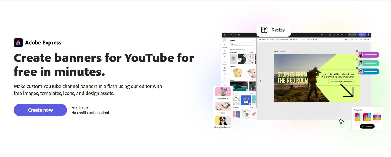
2. Use Adobe Express for YouTube Banners With Smart One-Click Editing
For creators who want a professional result without a design learning curve, Adobe Express is one of the strongest free options available. The YouTube banner tool within Adobe Express offers a curated library of channel-specific templates sized to YouTube’s exact specifications. One-click editing lets you replace placeholder text, swap background images from a built-in stock library, and update color palettes in seconds without touching the underlying layout.
What makes Adobe Express particularly practical is the combination of design quality and accessibility. The templates are professionally built, the font library is extensive, and the export produces a high-resolution file suitable for large-screen rendering. The free tier includes the core editing features, and the tool runs entirely in the browser with no download required, making it a reliable choice for solo creators and small teams alike.
3. Design Around the Mobile-Safe Zone From the Start
YouTube channel banners display differently depending on the device. The full 2560 x 1440 pixel image is only visible on connected TVs. On desktop, the visible area narrows significantly. On mobile, it narrows further to roughly the center strip of the image. Anything placed outside the mobile-safe zone will be cropped for most viewers.
Templates from quality banner platforms often include a visual overlay showing the mobile-safe zone, or structure the layout so key elements fall naturally within it. If your platform has no safe zone guides, keep your channel name, tagline, and call to action within the central third of the canvas. Social links and decorative elements can extend to the edges since they are less critical to the message.
4. Keep Your Channel Name Front and Center
Many first-time banner designers get absorbed in background imagery and decorative elements and end up burying the most important information: who this channel belongs to. Your channel name should be the first thing the eye lands on, which means it needs to be the largest, most visually prominent text in the design.
On a banner template, the headline text slot is pre-sized and positioned for maximum impact. Resist shrinking it to fit a longer channel name or tagline. If your name is long, consider an abbreviated version or a logo mark. Viewers scanning the YouTube header are registering an impression, not reading carefully, and that impression should lead with who you are.
5. Add a Social Proof or Upload Schedule Element
Once the channel name and visual identity are set, the next most valuable piece of information is what new viewers should expect. Many successful banners include a short upload schedule like “New videos every Tuesday” or a subscriber milestone that signals credibility.
These elements work best when visually distinct from the channel name but clearly readable. A lighter font weight and smaller size create a natural hierarchy that guides the eye. One-click template platforms often include a secondary text field for exactly this, so you typically just update the placeholder rather than build anything new.
6. Limit Yourself to Two or Three Brand Colors
One of the most common beginner mistakes is using too many colors. A palette that looks vibrant in your head often reads as chaotic on screen, especially as a relatively narrow header strip. Templates from professional platforms demonstrate good color restraint, but customizing can accidentally undo that if you introduce too many of your own colors.
A practical rule is one dominant color, one accent color, and white or black for text. If your brand has more colors, use the two most recognizable for the banner and reserve the others for other contexts. This produces a cleaner, more memorable banner and strengthens recognition across your thumbnails, end screens, and watermarks.
7. Use a Background Image That Enhances Rather Than Competes
If your template uses a background photograph or illustration, the image should set mood and context without competing with the text. A busy, high-contrast background makes text difficult to read. A well-chosen background has enough visual interest to feel polished but enough neutrality to let text sit clearly on top.
When browsing stock images, look for photos with even lighting, natural background blur, or strong tonal consistency trending toward either light or dark overall. Landscape shots, abstract textures, and out-of-focus environments often work better as banner backgrounds than sharp subject-forward images, because they provide atmosphere without demanding attention.
8. Match Banner Typography to Your Thumbnail Style
Your banner and your thumbnails are the two most visible brand surfaces on your channel. If they use completely different fonts and color treatments, the channel can feel inconsistent even if each element looks fine on its own. Aligning typography and color between banner and thumbnails creates a cohesive identity that signals professionalism.
When you settle on a banner design, note the specific font names used, which most quality platforms display in the editing panel. Use those same fonts, or close visual equivalents, in your thumbnail designs. Over time, this consistency trains your audience to recognize your content instantly in a crowded YouTube feed, which is one of the most powerful things branding can accomplish for a creator.
9. Save Your Design in an Editable Format for Easy Future Updates
Channel banners are not set-it-and-forget-it assets. Subscriber counts change, upload schedules shift, and seasonal promotions come and go. A banner that cannot be updated quickly becomes a source of friction. The most efficient approach is to save your design in the platform’s editable project format before downloading the final image.
Most browser-based banner makers let you save projects in the cloud with a free account, so your next update starts where you left off. Some creators maintain multiple saved versions for different seasons or events and swap them out as needed. Building this habit early saves significant time as your channel grows.
10. Preview Your Banner Across Device Types Before Publishing
Even a well-designed banner can have issues that only appear at a specific device size or aspect ratio. Before uploading to YouTube, use the built-in preview in channel customization settings, which shows how the banner appears on desktop, tablet, and mobile simultaneously. If critical content is cropped on any device, return to the editor and reposition elements until the preview looks clean across all three.
Some creators upload a test version first, check it on a phone and on a desktop browser, then make final adjustments before publishing. This extra step takes only a few minutes but prevents a cropped or misaligned banner from representing your channel to new viewers.
Quick-Start Checklist for Your Channel Banner
Before uploading your finished banner to YouTube, run through this checklist:
- Banner is sized at 2560 x 1440 pixels
- Channel name and key information falls within the mobile-safe zone
- Only two or three brand colors are used
- Text is legible at both full size and in the desktop strip view
- Background image supports the text rather than competing with it
- Upload schedule or secondary information is clearly readable
- Font choices align with your thumbnail style
- Editable project file has been saved for future updates
- Final banner has been previewed using YouTube’s multi-device preview tool
FAQ: YouTube Channel Banner Makers and One-Click Template Editing
What dimensions should a YouTube channel banner be?
YouTube recommends uploading channel art at 2560 x 1440 pixels with a maximum file size of 6 MB. This large dimension ensures the banner looks sharp on connected TV screens, which display the full image. However, since most viewers will see the banner on desktop or mobile, the more important measurement is the safe zone. For desktop, YouTube displays a central crop of approximately 1546 x 423 pixels. For mobile, the crop is tighter still. Any text, logo, or key design element should be positioned within the central safe zone to ensure visibility on every device. Online banner makers built specifically for YouTube often include a safe zone guide that makes this easy to verify before exporting.
Do I need to create an account to use a free online banner maker?
Most free online banner makers let you browse templates and start editing without an account, but they typically require registration before you can download the final design. Creating a free account is quick and unlocks the ability to save projects for future edits, which is worth it given how often channel banners need refreshing. Some platforms offer guest export with a watermark, useful for previewing but not for publishing. For a polished, watermark-free banner that you can update over time, a free account with a reputable platform is the most practical setup.
How often should I update my YouTube channel banner?
Most successful creators revisit their banner at least two to three times per year, or whenever something significant about their channel changes. A new content series, a subscriber milestone, an updated upload schedule, or a visual rebrand are all good reasons to refresh. The key advantage of working with a one-click template platform is that updates are fast. Once your base design is saved in editable form, swapping a tagline or background image takes minutes rather than hours. Tools like Google Trends can also help time banner refreshes around trending topics in your niche, since timely content can benefit from a banner that signals current engagement.
What is the difference between a YouTube channel banner and a YouTube channel icon?
The channel banner is the large horizontal image spanning the top of your YouTube channel page. The channel icon is the small circular image appearing next to your channel name in search results, on your videos, and in the subscription feed. Both are part of your channel branding but serve different purposes. The banner is a messaging surface where you communicate your niche, upload schedule, and personality at scale. The icon functions more like a logo mark and must be recognizable at very small sizes. When designing both, use the same color palette and visual style so the channel feels cohesive, but treat them as separate design tasks with different constraints.
Can I use the same banner template across YouTube and other social media platforms?
You can use the same design concept across platforms, but each has different banner dimensions, and using the exact same file without resizing will produce a cropped or distorted result. YouTube’s banner proportions are significantly wider and shorter than a Facebook cover photo or LinkedIn banner. The best approach is to design your primary banner in a YouTube-specific template, then use a resize or repurpose feature to adapt it to other formats. This keeps your visual identity consistent while ensuring the dimensions are correct for each platform. Many online banner makers include multi-platform resize functionality, and it is worth prioritizing when choosing a tool for your overall channel branding workflow.
Final Thoughts on Building a Channel That Looks the Part
Your YouTube channel banner is a signal before it is a statement. Before a viewer watches a single video, the banner tells them whether this channel is worth their attention and whether the creator takes their content seriously. A professionally designed banner built on a quality template communicates all of that in under a second.
The tools available today make it genuinely easy to produce a banner that would have required a designer a few years ago. The strategies in this guide, from choosing templates with the right visual energy to designing within the mobile-safe zone and saving editable project files, apply whether you are launching a new channel or refreshing an established one. The effort required to look professional on YouTube has never been lower.